


The first UK solo show by LA-based Sage Vaughn (referred to in early May) opened a few weeks back at Lazarides Gallery in London with a title ostensibly borrowed from the 1980 play by Mark Medoff or its subsequent film adaptation. While Children of a Lesser God presents no radical thematic or stylistic departures for Vaughn, the exhibition is a strong one — especially the part in the gallery’s main space on the ground floor, where canvases from the artist’s Wildlife series have been hung on walls painted a complementary pale grey. The show has now been extended until Saturday 11 June. AM has visited twice and recommends that it be checked out in person before it ends.
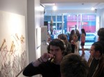
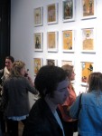
See more commentary and photographs, including snapshots from the enjoyable preview last month, after the jump.

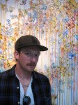
Vaughn in front of 'Ring Cycle (Rhinegold)'

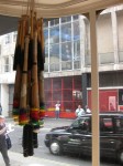
'Chandelier'

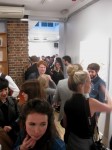
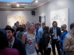
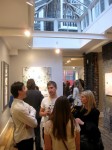
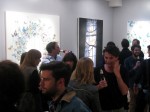
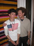
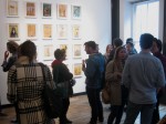
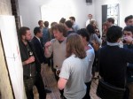
The preview evening for 'Children of a Lesser God'

'Shit Happens'
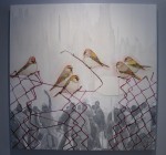
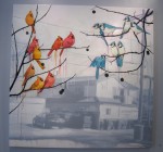
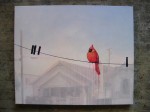
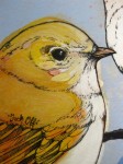
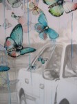
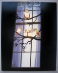
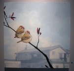
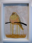
Whether it’s a charm of finches on a chainlink fence against the backdrop of a potential riot in the making or a flight of butterflies in front of some burning vehicle, those who’ve previously seen Vaughn’s work will be familiar with his approach. Using combinations of oil, acrylic, ink and vellum, the artist juxtaposes both mood and imagery. Brightly-coloured, crisp and detailed foreground subjects reflecting a certain innocence (at least at first glance) are regularly combined with dusky, translucent monotone backgrounds which often have a dark undercurrent.
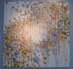
Vaughn is also fond of allowing his paints to run, Krink-style. With most other artists, this would be a source of great annoyance for AM; it’s a technique that’s simply been used and copied too many times. As with intentionally-applied splatters of paint, the dripping-paint look has very much become a cliché among second and third rate artists seeking to give their output a so-called urban aesthetic while also trying to mask their lack of skill. Such a contrivance becomes rather painful to witness after a while. Vaughn, however, manages to get away with his use of drips. He’s been doing it for so many years that it’s become one of his trademarks. And more importantly, he can actually paint. On a visual level, the dripping in our view supplements his work without appearing overly self-conscious.

'Too Sick to Pray' (left) and 'Things You Learn While You're Killing Yourself'


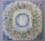
'Ring Cycle II'
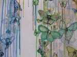
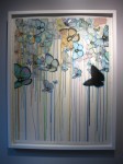
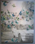
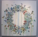
Highlights of the show include the intricate and layered butterfly pieces, both the smaller works on paper (especially the black paper) and the large butterfly rings on canvas. Regarding the latter, the canvases with a single ring of butterflies — which can more easily pass as a fortuitous formation in nature — are for us more effective than those featuring a double or triple ring. It looks like some time was also spent coming up with the names of the works on paper, such as Too Sick to Pray, Being Brave Lets No One Off the Grave and Things You Learn While You’re Killing Yourself. These particular titles are amusing even if they seem interchangeable: there doesn’t appear to be a direct connection between an individual title and the piece it relates to.
Dealing extensively with a subject matter so closely associated with one of the most commercially successful artists in the world takes courage, naivety and/or a special kind of masochism. Young artists attempting to do so set themselves up for constant comparisons with Damien Hirst and possible accusations of coattail-riding. Despite the risks, Vaughn has done well here. His use of butterflies is distinctive enough for him to stamp his mark and claim them as his own.

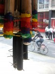
One of four individual butterfly nail-bats on display at the gallery

'Kill Em All'

'Kill Em All' (detail)
Special mention needs to be made of Sage Vaughn’s nail-studded baseball bats, which we’ve been a fan of for years. Is it too early to buy a 2012 Valentine’s Day present? Will we still feel as strongly towards our sweetheart come next February? These are the types of issues that keep AM awake at night and prevent us from getting our requisite eight hours.
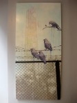
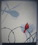
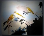
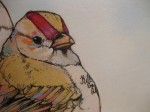
We’re also keen on a number of the canvases featuring birds in city or suburban settings, their appeal heightened by the tattoos hidden within the plumage of some of the birds: black-ink messages like Your Shit is Dope, This Means War and Kill Em All. If these little subversive elements fail to raise even a wee smile, then it’s likely the viewer has become old in spirit — in which case they should perhaps pay heed to the final three words (taken out of context with joyous disregard) of our favourite replicant, Roy Batty.

'Misfit (Salvation)' (left) and 'Misfit (Purple Shoes)'
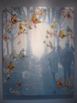
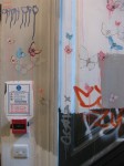
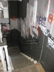
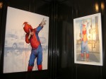
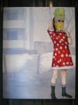
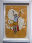
Visitors wishing to see the second part of Children of a Lesser God need to access the gallery stairwell which Vaughn has filled with butterflies, as well as tags in a nod to his days as a writer / graffiti vandal. Among the art hanging upstairs are three pieces featuring solitary children wearing masks or superhero outfits. These are part of the artist’s Wildlives series, to which the show’s title seems most applicable in the literal sense, although for us they work less well than the birds and butterflies downstairs. With facial expressions of the children hidden, it becomes more difficult for the works to engage the viewer. Rarely have we seen this subject matter covered in a completely successful manner with still images — an exception being in the medium of photography with the print Untitled (Sad Vader) by Alex Brown.

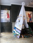
Upstairs: 'Left to My Own Devices' (left) and 'Misfit (Salvation)' (right) framing a teepee-like installation

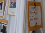
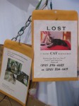
Lost-cat flyers adorning Vaughn's installation
If AM were to choose one weakness of the exhibition, it would have to be the teepee-like installation adorned with lost-cat flyers collected by the artist and affixed to manila envelopes. Within the installation can be found random objects such as an ashtray, Krink, a box cutter, and blankets, including one with an image from a photo of Vaughn with the late Dash Snow and another friend. The structure certainly captures your attention as a curiosity piece, perhaps representing a child’s almost instinctive urge to build forts, demarcate territory and create a personal safe zone — thematically in line with the three pieces mentioned above. Nevertheless, the impression we had was that it was put together almost as an afterthought to fill up space.
We’ll go off on a bit of a moral tangent now. Please humour us as we do so since the only exercise we ever get these days is jumping on and off our high horse. As a separate point regarding the teepee-like structure, there’s an ethical matter we’re having difficulty overlooking: the removal of missing-cat flyers from the street, which further reduces the already small likelihood of animals being reunited with owners desperate for their return. Yes, we’re a bit old-fashioned like that, or perhaps the euphemism “retro” is a more palatable expression.
Can the act of taking down lost-pet posters be justified by the production of an art installation? Possibly, but the art had better be excellent. If, in the pursuit of creative endeavours, an artist acts in a manner that can be viewed as not inconsistent with being a bad human being — including by what can arguably be described as flippantly using the sorrow and loss experienced by others — then they need to compensate by bringing something new and interesting to the table. Our position is that Vaughn’s use of the posters doesn’t meet that criteria: missing-pet flyers in an art context have been done before, most notably by Erik Brunetti in the mid-nineties with Lost. And that assemblage was recreated this year for Art in the Streets (an exhibition featured here and in numerous other AM posts) at MOCA. Whether it’s for reasons of antecedency, scale or overall tone, we have less issues with Brunetti’s large installation than with the much smaller number of flyers Vaughn took down.
While chatting with us, Vaughn did admit a slight pang of guilt about removing one poster in particular, with text (complete with spelling error) that had clearly been scrawled by a child: “Lost Simese Cat”. He suggested he may go to hell because of it. AM concurs. Regardless of how nice he is, the artist is likely to roast for all eternity over that one. At least if there is a hell — which would be somewhat inconsistent with our militant atheism. Maybe Vaughn should start praying that we’re right about god (whether lesser or greater) not existing.

Upstairs: Vaughn's collage, painted and drawn works on manila envelopes

Noteworthy in the upstairs area of the gallery is a wall of 20 framed, collage, painted and drawn works on manila envelopes. AM has long been enamoured with the symbolism of art on envelopes. This part of the exhibition was therefore of particular interest to us, bringing to mind the legacy of Ray Johnson, the whole Mail Art / Postal Art phenomenon, and works by artistamp artists — from the delightful creations of Donald Evans to the pranksterish subversions of Michael Hernandez de Luna and Michael Thompson.
Vaughn’s envelopes are looser and rawer than the pieces in the rest of the show, as if serving as both artworks in their own right and studies for possible canvases. One senses that this medium offers the artist a greater freedom which he no doubt welcomes. It allows him to venture in and out of the confines of the style and themes he’s recognised for, which his collectors have come to expect (and perhaps demand) of him.
If he hasn’t already tried it, a future project option for Vaughn would be to self-address and mail a few of his envelopes, thereby extending the artistic process and conceptually reinforcing his choice of medium. The presence of an address and cancelled stamps may well amplify the charm of these works. It would, however, also change their nature and introduce the risk of envelopes going missing — perhaps ending up in the private collections of dishonest, art-loving postal workers.
That said, Vaughn’s envelopes can be seen as a characteristically 21st-century offshoot of Mail Art — where, for an individualistic society, the movement’s original ideal and fundamental goals of correspondence and collaboration are abandoned in favour of work produced by a single artist. In a culture obsessed with celebrity, image and all that is superficial, there’s also a logic in restricting the art to the exterior surface of envelopes which are empty inside. And given that online communications have superseded many exchanges previously made by letter, it now seems almost fitting for the actual posting of Mail Art to become redundant.
Children of a Lesser God runs until Saturday 11 June.


-
- Vaughn in front of ‘Ring Cycle (Rhinegold)’
-
- ‘Chandelier’
-
- ‘Chandelier’ (detail)
-
- ‘Children of a Lesser God’
-
- ‘Ring Cycle (California)’
-
- ‘Ring Cycle (California)’ (detail)
-
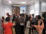
- The preview evening for ‘Children of a Lesser God’
-
- ‘Shit Happens’
-
- ‘Too Sick to Pray’ (left) and ‘Things You Learn While You’re Killing Yourself’
-
- ‘Stranger’
-
- ‘Untitled’
-
- ‘Tuff Shit’
-
- ‘Tuff Shit’ (detail)
-
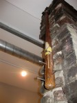
- One of four individual butterfly nail-bats on display at the gallery
-
- ‘You Will Miss Me When I’m Gone’
-
- ‘Being Brave Lets No One Off the Grave’
-
- ‘Fuck Off Goldies’
-
- ‘Fuck Off Goldies’ (detail)
-
- ‘You Can’t Take it With You’
-
- ‘You Can’t Take it With You’ (detail)
-
- ‘Behind the Wall of Sleep’
-
- ‘Ring Cycle II’
-
- ‘Ring Cycle (Rhinegold)’
-
- ‘Kill Em All’
-
- ‘Kill Em All’ (detail)
-
- Stairway at the gallery covered in butterflies and graffiti
-
- Gallery stairway
-
- Vaughn with his studio assistant, Anthony Anzalone (left)
-
- ‘Misfit (Salvation)’ (left) and ‘Misfit (Purple Shoes)’
-
- Upstairs: ‘Left to My Own Devices’ (left) and ‘Misfit (Salvation)’ (right) framing a teepee-like installation
-
- Lost-cat flyers adorning Vaughn’s installation
-
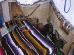
- Inside the teepee-like installion: Among other things, an ashtray, Krink, a box cutter, and a blanket featuring an image of Vaughn (centre) with Dash Snow (left)
-
- ‘Left to My Own Devices’
-
- Upstairs: Wall of 20 manila envelopes serving as canvases for Vaughn’s smaller collage-based, painted and/or drawn works
-
- Upstairs: Vaughn’s collage, painted and drawn works on manila envelopes
Text and photographs by Patrick Nguyen.