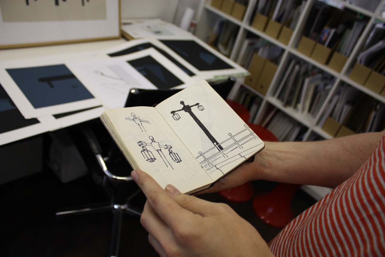
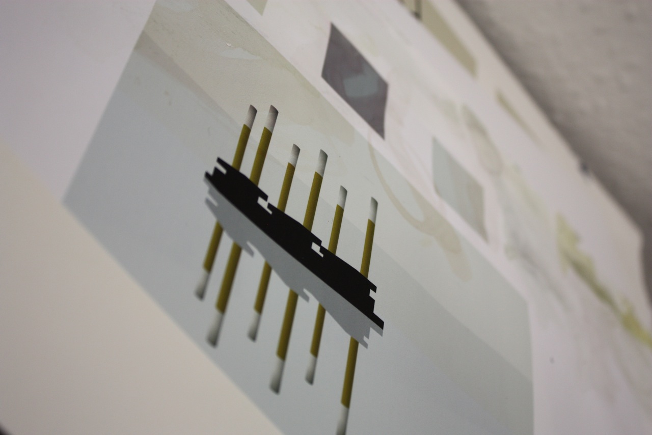
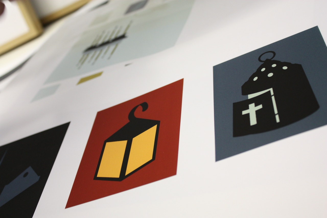
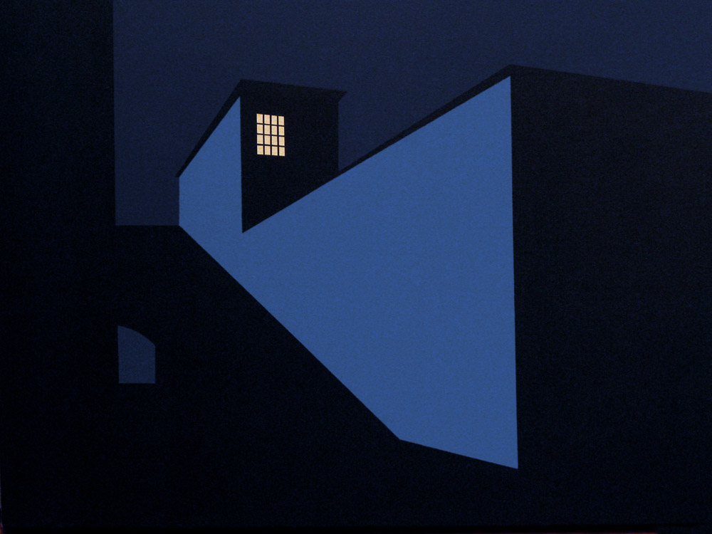
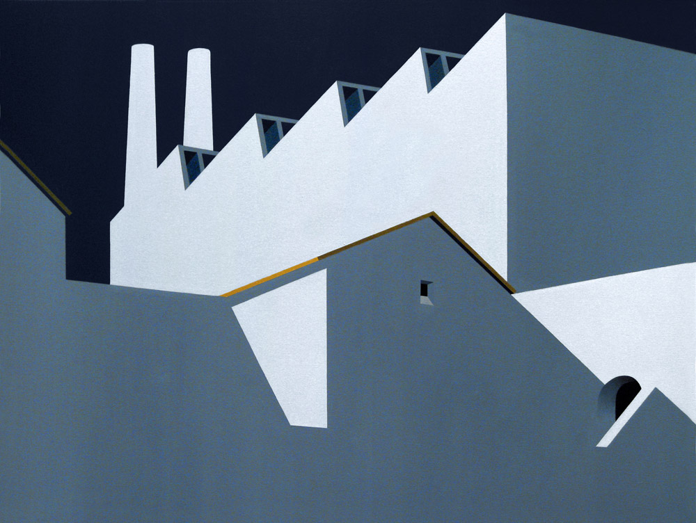
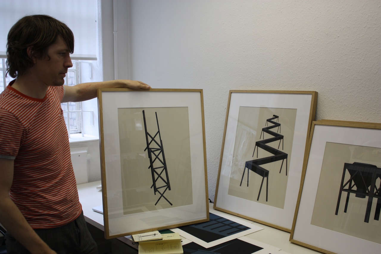
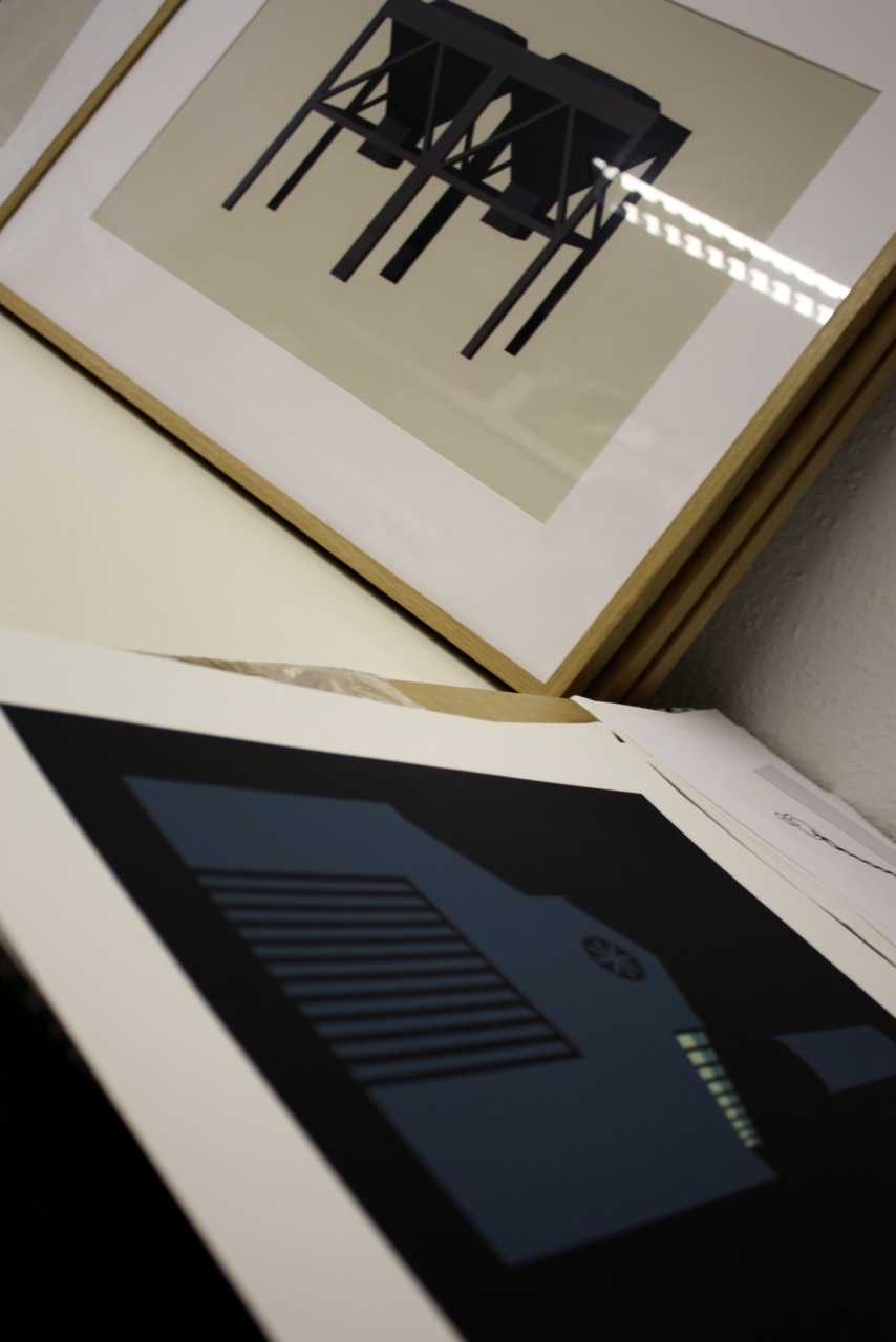
AM came across Marcus Freeman’s paintings last year, and we instantly loved how he mixes a superflat representational style of depicting the built environment with the cleanliness of Ed Ruscha & Patrick Caulfield’s pop art stylings. Some of the elements of Industrial architecture and landscapes used within his paintings are found and photographed locally by Freeman, and some are either assembled from a series of his found sources or invented based upon sketched concepts.
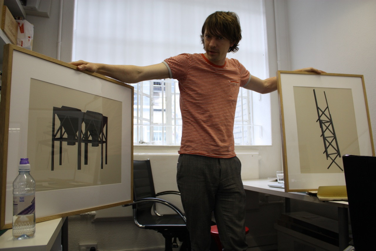
We arranged to take a look around his design studio, where he works as a partner of a creative design agency, and Marcus showed us some of his paintings, drawings and prints. Take a look around with us after the jump.
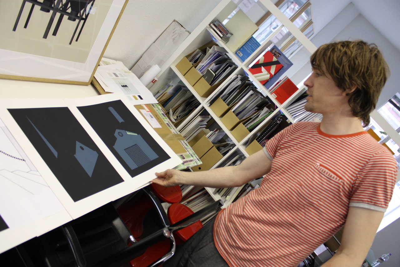
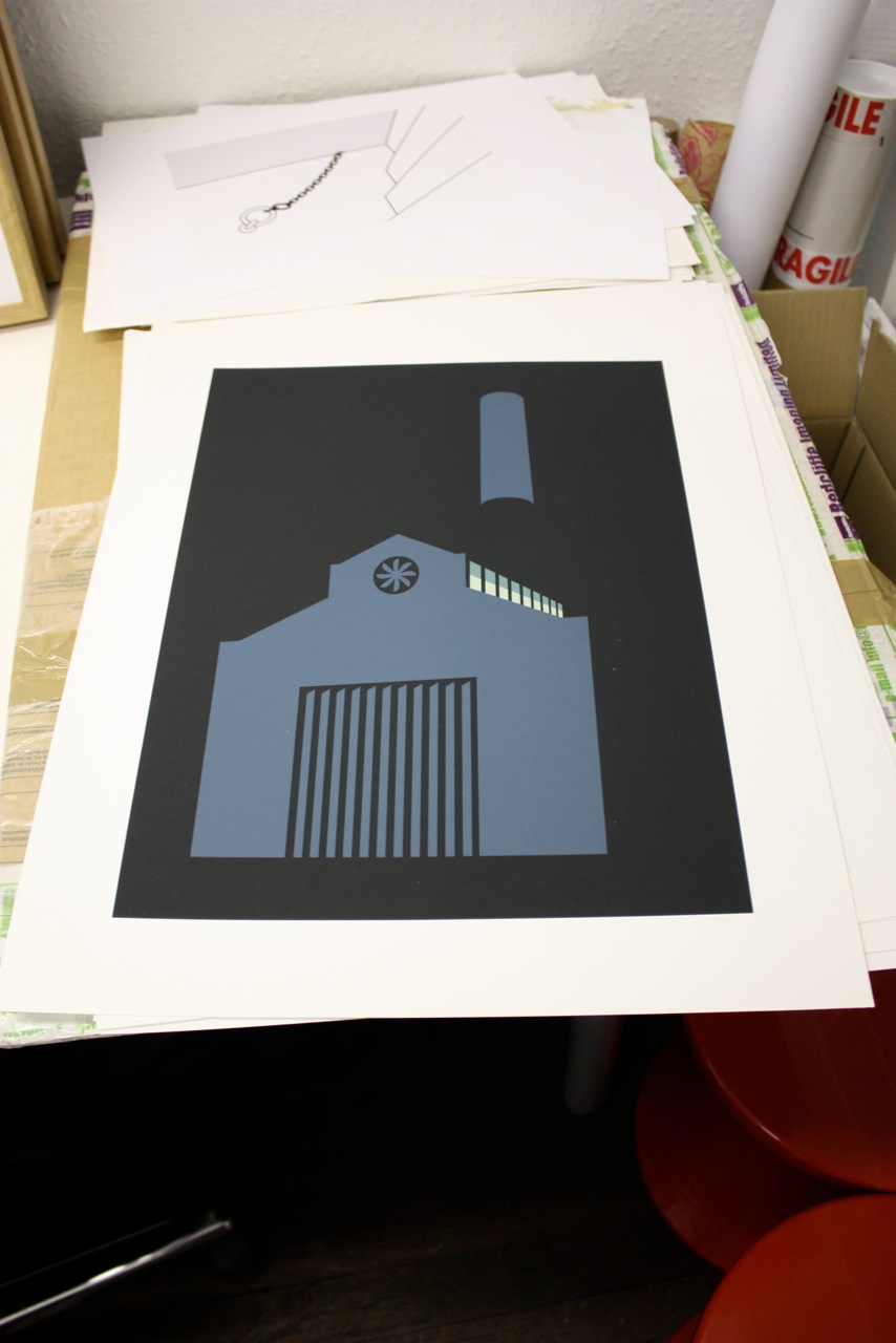
The majority of Freeman’s work deals with urban landscapes and structures. He described his ideal building to us as a combination of an industrial warehouse and a church. This aesthetic can be seen in one of his prints below, with the traditional entrance of a church building replaced by an industrial loading door.
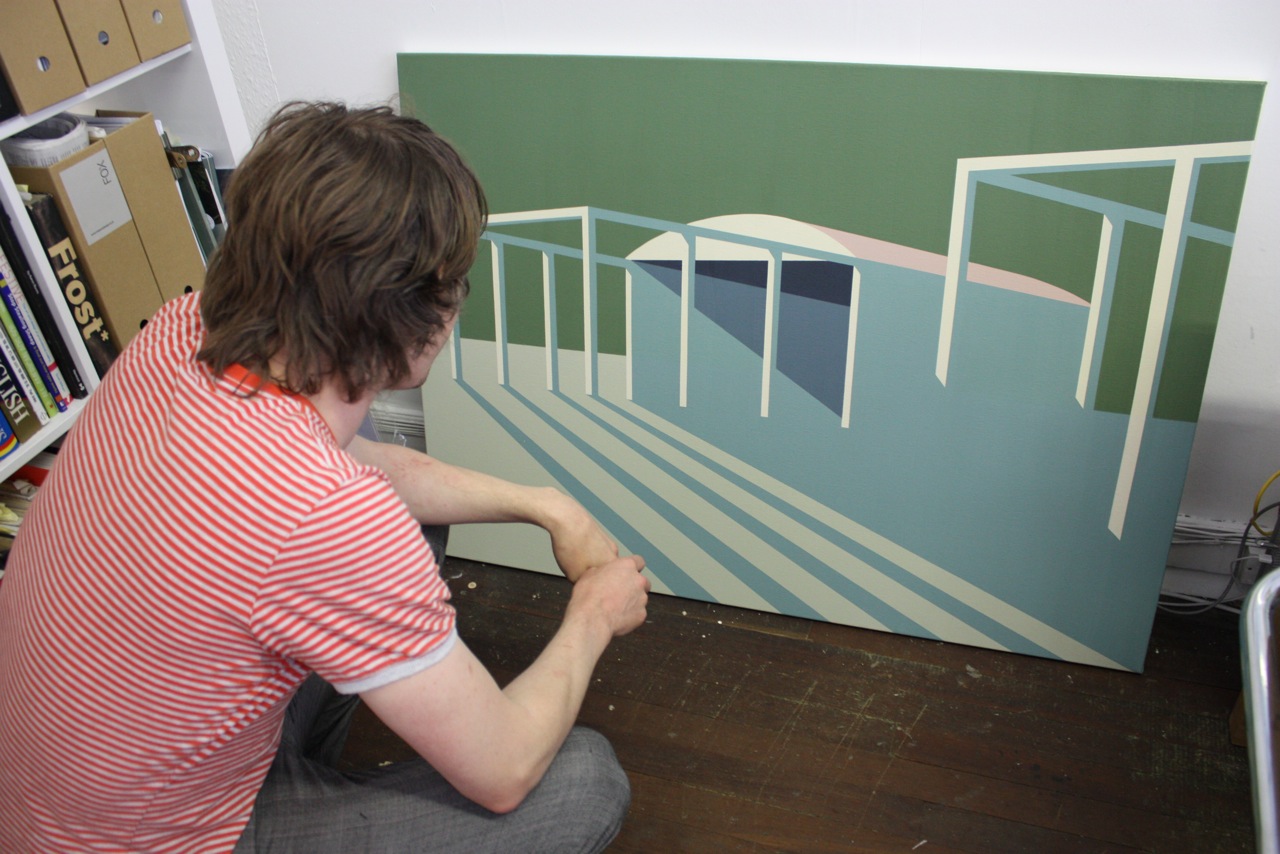
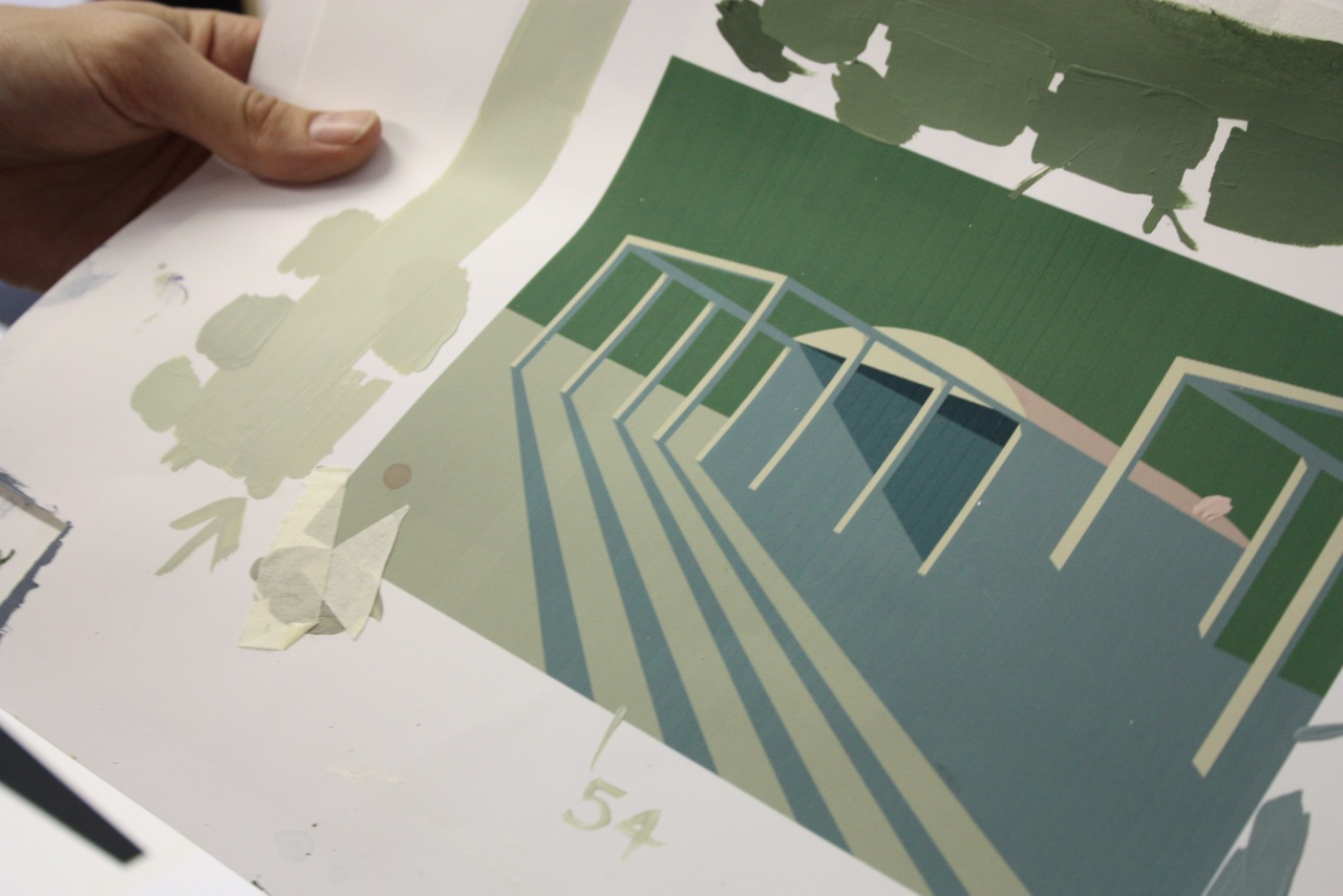
Freeman sees beauty within the importance and strength of ‘the unremarkable building’ versus the bells and whistles approach to architecture so freely and often applied to buildings. It is the utilitarian and functional that fascinates Freeman, and this focus on the simple form combined with his carefully selected colour palette that adds to the dynamic of his painting. Marcus told us of his deliberation over the selection of colours used within his paintings, spending hours blending and re-blending acrylics to find the perfect colour combination – with the successful green used in ‘Shed’ being shade and mix number 55!
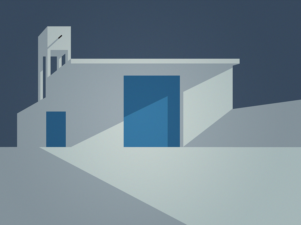
Freeman’s depiction of architectural elements stems from his desire to experiment with the interplay of the stripped down forms and how the path of light and shadow can imprint it’s influence and create atmosphere and depth within the landscape. By using this level of hyper-simplified clarity, and deliberately omitting the confusing details and textures that a landscape can possess, Freeman presents his interpretation of the necessary elements of landscape painting – dimension, atmosphere and purity.
- Colour study for ‘Shed’
- Landscape ii
- Bunker
- Warehouse iii
- Factory
- Down by the River
- Farm Building
- Landscape i
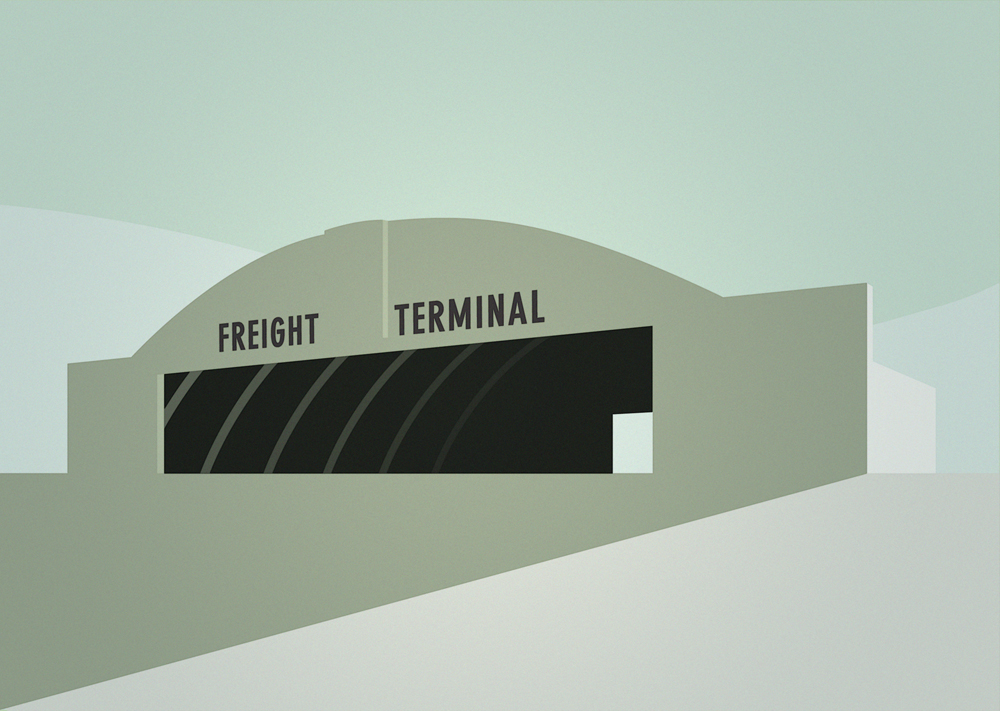
- Freight Terminal
- Silos
- Warehouse i
- Siding
- Gates
- Generator
- Entrance
- Warehouse ii
Discuss Marcus Freeman here.


