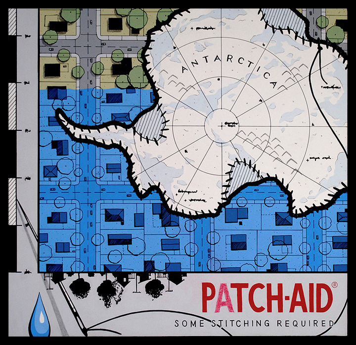
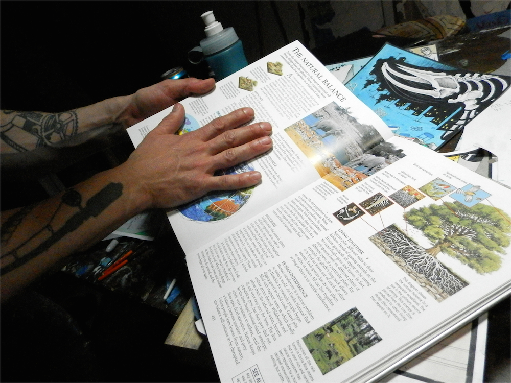
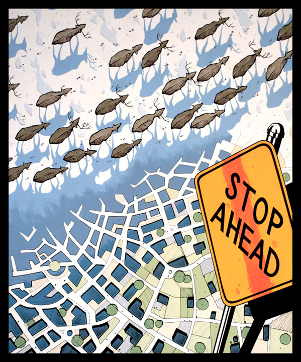
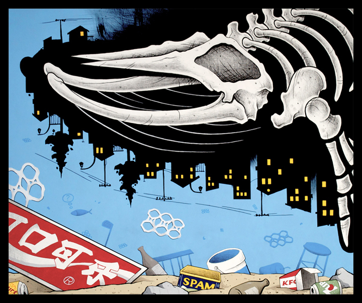
Portland-based artist Chris Valkov follows up last year’s solo exhibition at Breeze Block Gallery (covered) with a new body of work entitled The (sub)Natural Balance this week at Portland’s Antler Gallery. Thematically challenging anti-consumerism and ecological topics, his bold work is visually striking with the architectural style he employs within his painting work.
AM caught up with Chris to ask a few questions ahead of the show which opens on Thursday, the 31st of July.
Arrested Motion (AM): Can you explain a little about your background Chris?
Chris Valkov (CV): Well, I was a bit of a slacker in high school and was worrying my parents with delinquent behavior. So naturally I was given the choice to either get into a college or go to the army. Obviously, I tried out for collage. While growing up, I was always drawn to the diagram like blueprints my engineer father was often working on. So ,I tried to get into architecture but didn’t make the cut. Facing army time, I settled for Landscape Architecture. Didn’t care much for landscaping, but I did learn to draft, which I enjoy still. After a decent run at being a hand draftsman for various small design offices, I hung up that trade. It all turned computer, and I sure didn’t wanna be a computer operator. I like crafting images with my hands.
AM: From what I understand, you arrived at your very graphical and draughtsman-like aesthetic that is employed throughout your work through a history of architectural draughting. The hand drawn aesthetic is something I can relate to on a personal level as I started out drawing by hand on a board and it’s somewhat of a dying skill in architecture these days…
CV: For sure. Hand draftsman is like being a contemporary blacksmith – nostalgically adorable. But I still get random projects from time to time from contractor friends who appreciate a sharp pencil line on vellum.
AM: You describe your self as an ‘image engineer.’ Can you explain a little about how you arrived at this title? I assume it’s a way of dealing with your multi-disciplinary creative outlets of painting and tattooing…
CV: Well, I kinda came up with that as a lighthearted catchy quote for my website. I’m not claiming any legitimate title or anything. As I was freelancing illustrations, drafting services, learning to tattoo, and dabbling with fine art, I was always utilizing much of the schematic visual vocabulary used by architects, engineers, and scientists. It’s what I knew and what I like. So whenever I get another image to come up with, I engineer that thing. It’s working good so far.
AM: How did you first get into tattooing? You run a seat at Grizzly Tattoo in Portland, right? What sort of time do you split between painting and tattooing? Do you have a typical routine?
CV: In my early twenties, I was getting tattooed a lot. I always drew my designs and brought them to my tattooers with whom I became good friends with. I was a “pain in the ass” customer with weird diagram tattoos but one tattooer friend really recognized my approach as something a portion of tattoo collectors would embrace. He encouraged me to learn the trade and I listened. I now tattoo at Grizzly three or four afternoons a week and paint at the studio at night after work.
AM: Do you tend to approach a tattoo and a painting in a completely different way, or is the process very much aligned in terms of creating an image?
CV: I used to approach them similarly, but now it’s different. I draw a tattoo per client’s given ideas, incorporating my compositional taste. But I always keep it pretty safe. Make it unique but widely likable. It makes for happy clients. On the other hand, I compose a painting as a pure self-expressive means.
AM: Your aesthetic is very unique for both a tattoo artist and also as a painter. Have you found that people seek you out for a tattoo after seeing your painting style?
CV: Definitely! That’s kinda my bread and butter. People ask me for tattoos that other people in town don’t do. Demand has grown much that I can make a comfortable living merely specializing. I’ve never tattooed a koi fish or a pin-up girl. Thank God! I’d be terrible at it.
AM: This new body of work for your upcoming exhibition seems to build upon the environmental and anti-consumerism themes we’ve seen in your work previously. Where does your interest in environmentalism originate?
CV: I don’t know… I just feel like if I’m gonna bother painting something, it better not only look good but it should also mean and say some stuff I feel strongly about. And my gut intuition has always pulled me to comment on the growing dysfunctional relationship between gluttonous consumer societies and the natural world which we are a part of. It’s extremely alarming to me and completely fixable. Unsustainable human lifestyle is not a necessity. It’s us being spoiled. But, nature’s bills always come due.
AM: Have you ever carried out or considered putting images of your work out on the street? I could see how you artwork would make for a great culture jamming campaign…
CV: No I have not. But I’m very interested in doing so. I just haven’t gotten around to sifting out a good opportunity. It’s definitely on my agenda. The street muralist community around the world that you guys cover often are absolute spokespersons of our generation. Very inspiring stuff.
AM: And with the work for the show – The (sub)Natural Balance – itself. You’ve made a departure from your traditional One-Shot enamel paint and are using a mixture of acrylic and pastel. Do you find this gives you more freedom and fludidity? I know that enamel is very non-forgiving!
CV: Yeah, this year I wanted to add some sketch-like drawing elements incorporated with the paint. Acrylic allows for that which enamels don’t. I feel it helps me render my ideas in an interesting and somewhat gestural way. It kinda adds some personality to it by cheating a little. I don’t have to learn to render and blend like a trained master painter. He, he! Never went to art school so I gotta make my own curriculum.
AM: Many would describe your paintings as ‘super-flat’. The accuracy of the line work almost looks machine made. Are you still using the door panels as your canvas? I think that flatness, but the depth of the canvas works very well combined with your graphical style…
CV: I used to really push for that clean hard edge for a while. Not sure why. But I’m totally okay with an apparent hand made look now. It makes the work more human but still sharp. I’m totally painting on reclaimed closet doors still. They are so much better hanging on a wall than rotting in a landfill.
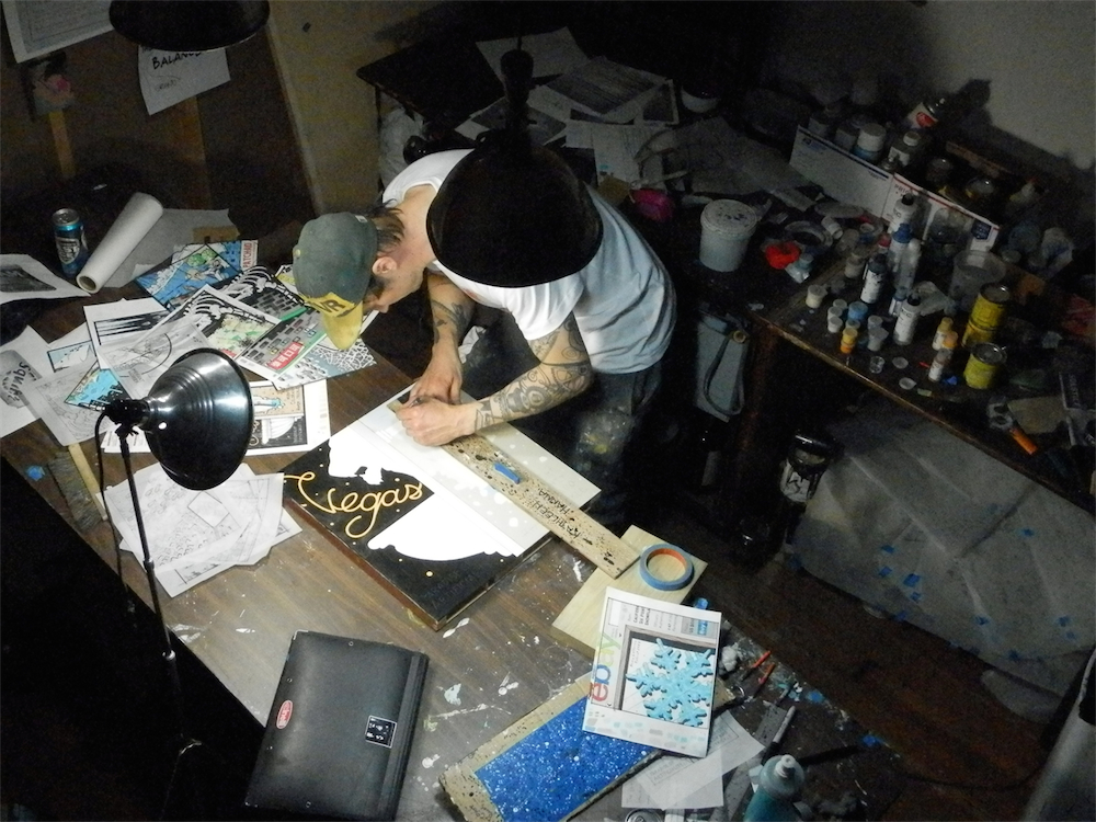
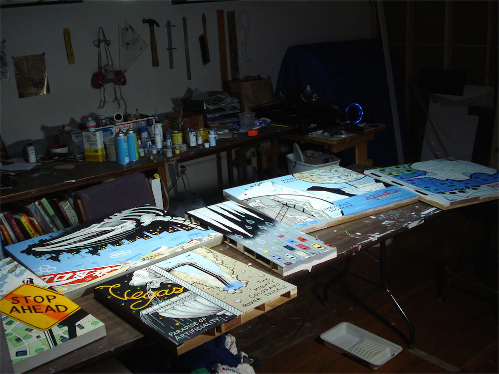
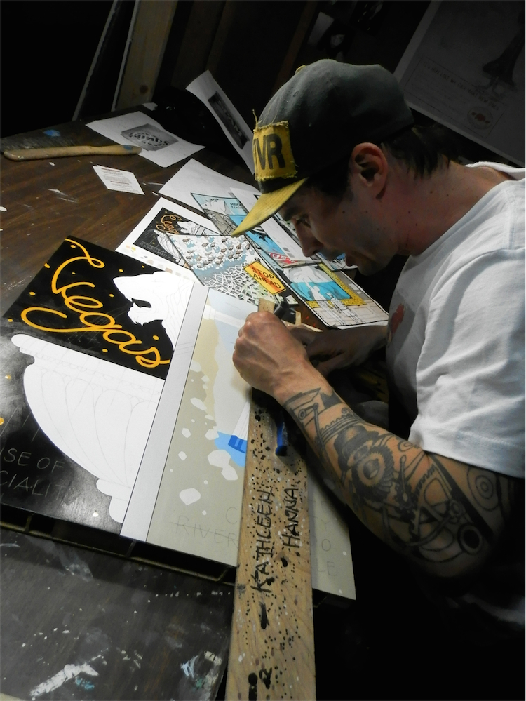
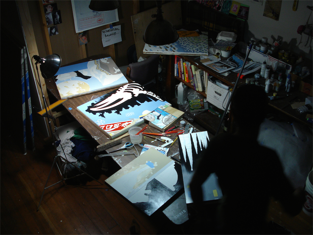
AM: I’ve seen you at work in the studio before and you often seem to have a series of painting in progress at any one time. Can you describe how you tend to work?
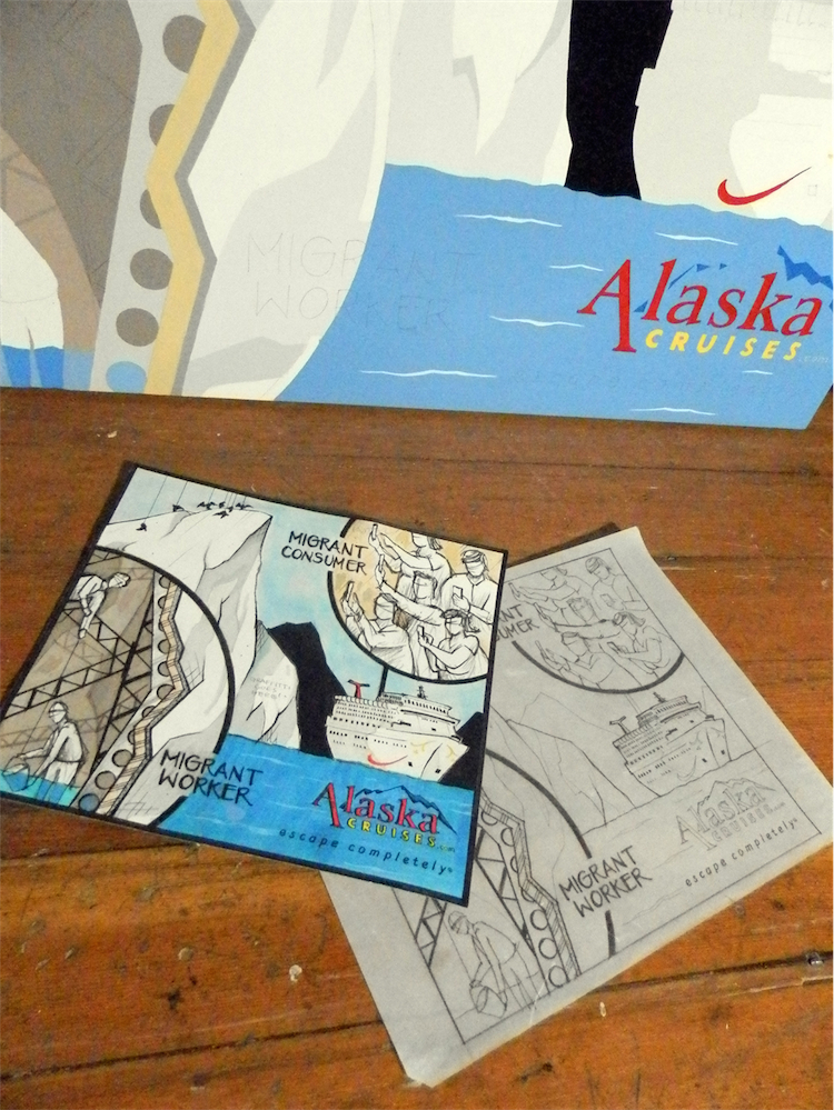
CV: Yeah, I usually figure out several rough draft concepts on paper and get all the panels going all together. It’s just more efficient for me. Especially when I use certain color mixtures on multiple panels.
AM: Finally, I’ve got to ask about the colour palette you use. What draws you to the combination of colours you use?
CV: No particular formula here. My color theory is very lackluster. But I do tend to stay on the lighter more pastel side in value because the contrast in gives against graphic black outlining is strong. I also am no big fan of dark and gloomy paintings. I guess I never had my goth phase.
AM: Thanks for your time Chris. Best of luck with the show!
CV: Thank you guys!


