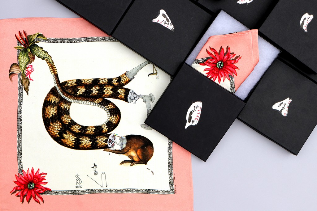
Art historian Hector Campbell sat down with British artist Daniel Sparkes aka Müdwig to discuss his early street works, artistic influences, the evolution of his gallery work and his collaborations with fashion brands. The British artist also recently teamed up with art collective Fluorescent Smogg to release a new limited edition printed silk pocket square, available here.
Hector Campbell (HC): Many people will have first encountered your artwork around 15 years ago through your series of altered billboards, which became known as the ‘Mudverts’. What drew you to this outlet for artistic expression?
Daniel Sparkes (DC): Just before I started painting the billboards around Bristol, I was doing a lot of digital drawing on the old photoshop, biro forms scanned in and assembled over photos, all done meticulously on my computer in the comfort of my boudoir. When a graffiti writer moved into our house with his hundreds of spray paint cans, I was inevitably encouraged to start enlarging my work into walls. Billboards were unusual targets at the time, and were the logical phase-up from my computer montages. Comparatively, they were a huge thill to paint, as their highly visible positioning meant I had to work fast, at night, often with bystanders watching and having to mentally block out constant traffic presence. I only painted them for about a year as I got policed enough times for me to have to stop.
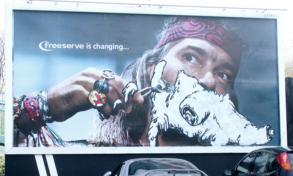
Müdwig – Altered Billboard, Bristol c. 2003
HC: You gained a name for yourself in the UK graffiti and street art scene, under the pseudonym Müdwig, through the aforementioned subvertisements as well as your work as part of the Wet Shame Krew. How do you feel this street work still influences your fine art practice today?
DS: I’m still using a lot the same visual tropes in my own work today as I used within WSSK, I still paint with those guys occasionally and we can revert to what we did together in the past. There’s an invented language that still exists individually and collectively for us, it’s timeless as it never really fitted into the rest of the street art thing that was going on at the time. My ‘street work’ was about simplifying, streamlining and emboldening the more complex abstractions I was making on my computer, whilst cultivating an obscure yet familiar set of visual totems. Now that I’m making large-ish oil canvases, a lot of the ‘rules’ I made for myself when painting murals and billboards still apply and inform the current studio paintings.
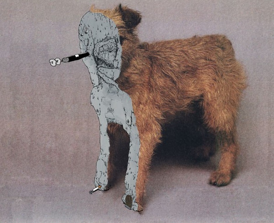
Müdwig ‘Teddy’s Edge’, Acrylic on Poster, 2010
HC: Your fine art practice often includes painting onto found photographs, juxtaposing captured reality with your surreal, cartoonish additions. How do you go about selecting which images to doctor into original works?
D.S: It does vary with what I’m trying to suggest conceptually, but as a rule I’ve always been drawn towards what I consider to be quite banal, domestic contexts to use a backdrop. Images from old cookery books, pet grooming books, 1970’s National Geographic magazines, and model making annuals all have a rich and familiar nostalgia. There cannot be too much visual noise otherwise anything you add only over-eggs the eye pudding, so I often crop the images right down, sometimes reducing the photograph to tones and textures and an abstraction in itself. On the other hand, I can go crudely in the other direction comically lopping limbs off Playboy models. Dogs have been an ongoing subject/symbol in my work for years. They intrigue me, how man-made they are, how funny they look, how they sit so happily in car passenger seats and how we pick up their bum-nuts in tiny carrier bags. I’m sure I will artistically meddle with them for years.
HC: You recently released a set of prints with Fluorescent Smogg which featured your signature imagery transplanted onto two Gustave Doré Bible woodcuts from 1866 (Samson Killing a Lion and The Temptation of Jesus). Do you find that art history often influences your work?
DS: Totally. I think I often try and go a bit further back into art history to avoid being too caught up in the aesthetic art trends going on around me. I’ve always pinched inspiration from a wide range of old culture: cartoon characters, tree-stumps, Nazi bunkers, wood-chipping machines, Caravaggio, Bruegel, Hokusai, Happy-meal toys, Asterix, Seuss and submarines. This has probably meant I have not really fitted into one easily defined genre and due to medium tweaks, I have a few visual styles that I constantly traverse. I don’t consider myself unique in this at all, I think most artists worth their salt will have wide range of points of reference.
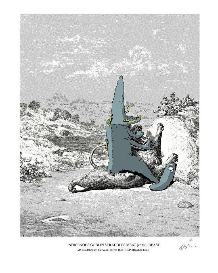
Müdwig x Fluorescent Smogg, ‘Indigenous Goblin Straddles Meat {Consu} Beast’, 4 Colour Screen Print, Edition of 25
H.C : Your work has featured in exhibitions at some prominent UK art institutions, including the Royal West of England Academy (Crimes of Passion, 2009) and Somerset House (Mapping the City, 2015, covered). Do you see a strong future for genres such as Comic Abstraction and Urban Art?
DS: Yes, because the comic/lowbrow element has played a lead role in art for a long time already. Since Pop Art’s acknowledgement, cartoon icons are now as reference-able as the cast of the biblical/classical narratives were in the art of previous centuries. The appeal comes from the integral part those characters play within our visual culture past and present, the comic aesthetic can be seen as a visual shorthand that we have all been aware of since childhood. It has an instant levelling, a cutting purity and a power and relevance, with an applicable finger in, not just all art genres but, most aspects of our visual culture. In that respect, without listing 100’s of artists and examples of comic abstraction in art, I’ll just quote Helen Marten [2016 Turner Prize Winner] in saying, ‘The line of the cartoon activates substance beyond conventionally plausible limits’.
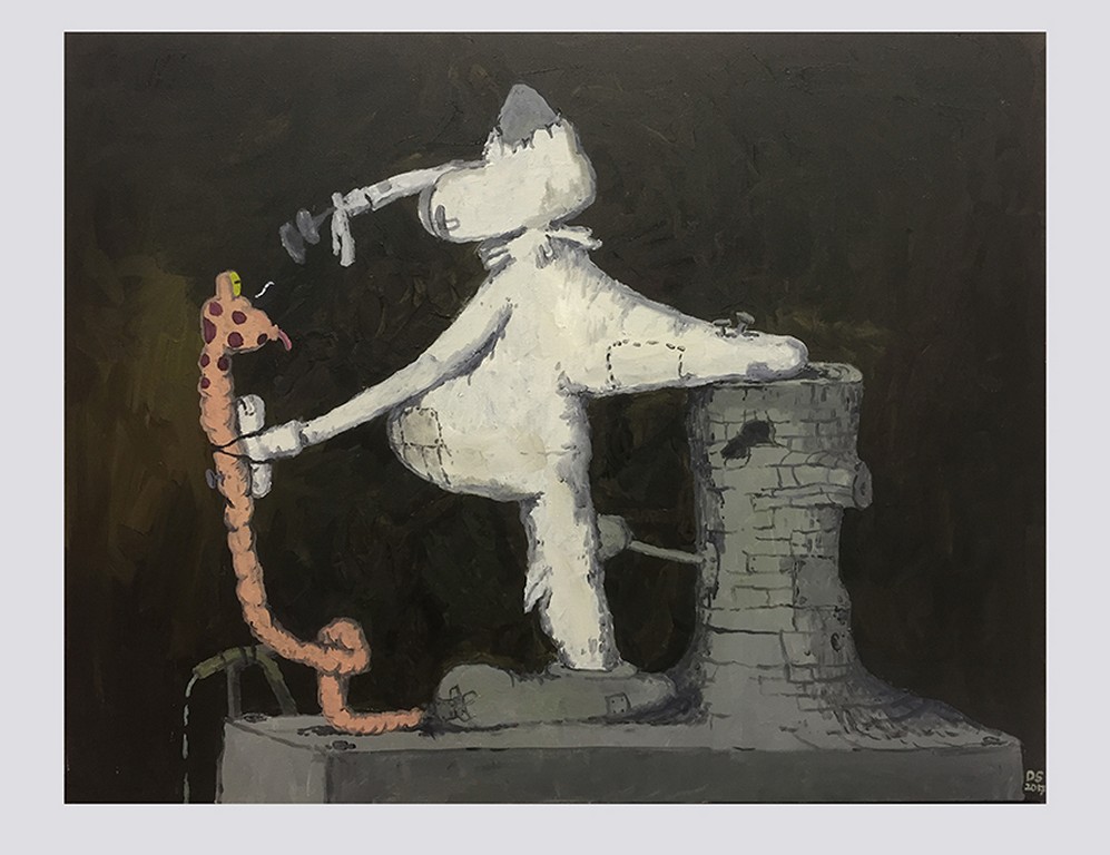
Müdwig ‘GDR throttlined 1440’, Oil on Canvas, 2017
HC: Your more recent gallery work (‘The Teutonburg Pellets’ series) sees a departure from the use of found photos and pre-existing imagery in lieu of more conventional oil on canvas paintings. What led to this new evolution in your work?
DS: In an honest nutshell, [Philip] Guston. I am totally in awe of the sedate yet buzzing comic weight and power of his later representational paintings. The place his works ended on his death in 1980 is where I unashamedly chose to launch my oil painting campaign from. By initially imitating the technique but trying to speak my own language in Guston’s visual accent I felt my work evolve. The aim now is to avoid total plagiarism and create a visual world unique, yet aware of its homage. I still make digital drawings, graphite works and gouache on photograph works, but when I need to get looser and more ‘plastic’, the fluidity and heritage of putting oil to canvas is entrancing.
HC: You have collaborated with a number of fashion brands including Nike, Sixpack and Givenchy, and now Fluorescent Smogg just released a limited edition silk pocket square adorned with your art. Why do you think your artwork lends itself so well to sartorial collaborations? And is fashion a medium you enjoy exploring?
DS: I do. We live in post-pop times where creative diversification is applauded and lapped up by the masses, this can be lucrative both economically and ego-nomically for the producer, and for me it personally provides a satisfying challenge to make my often conceptually obscure artwork in different contexts. Fashion is probably of the most immediate methods of artistic visual expression, and it’s always a huge honour when someone chooses to emblazon their chest with an oddball image I have created. I think that’s why even the most successful artists in the world (who by no means need the money!) can regularly be seen collaborating with big brands and designers. I think there’s a highly desirable third realm alchemy achieved when two artists, brands, or fashion houses collaborate to make something very unique and contemporary.
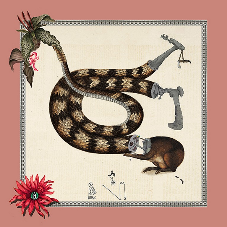
Müdwig ‘The Silk Snape Wipe 18’, Printed Silk Pocket Square
The new limited edition printed silk pocket square, entitled The Silk Snape Wipe 18’ will be released in an edition of 45, and come in a unique hand-painted box featuring one of Müdwig’s withered eyes. Available here.


